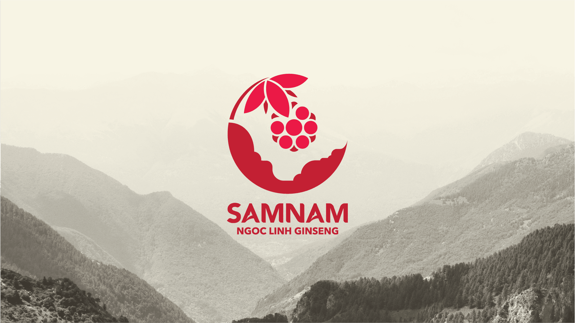
SAMNAM
Branding - Web Design
SAMNAM is a reputable brand specializing in products made from Ngoc Linh Ginseng – a rare and precious ginseng variety found exclusively in the Ngoc Linh mountain region of Vietnam. Committed to delivering the finest natural values, SAMNAM continuously strives to research and develop high-quality product lines, ensuring safety and effectiveness for users' health.
SAMNAM - Ngoc Linh Ginseng is a distinctive brand born from the strategic collaboration between NutiFood and Quasapharco, focusing on harnessing and developing products from Ngoc Linh Ginseng – one of Vietnam's most precious and rare ginseng varieties. Combining NutiFood's modern technology and Quasapharco's high-quality herbal resources, SAMNAM delivers optimal health care products, ensuring safety and effectiveness. The SAMNAM brand is not only a source of pride for Vietnamese people but also a significant step in elevating Ngoc Linh Ginseng to global prominence.
Logo Idea
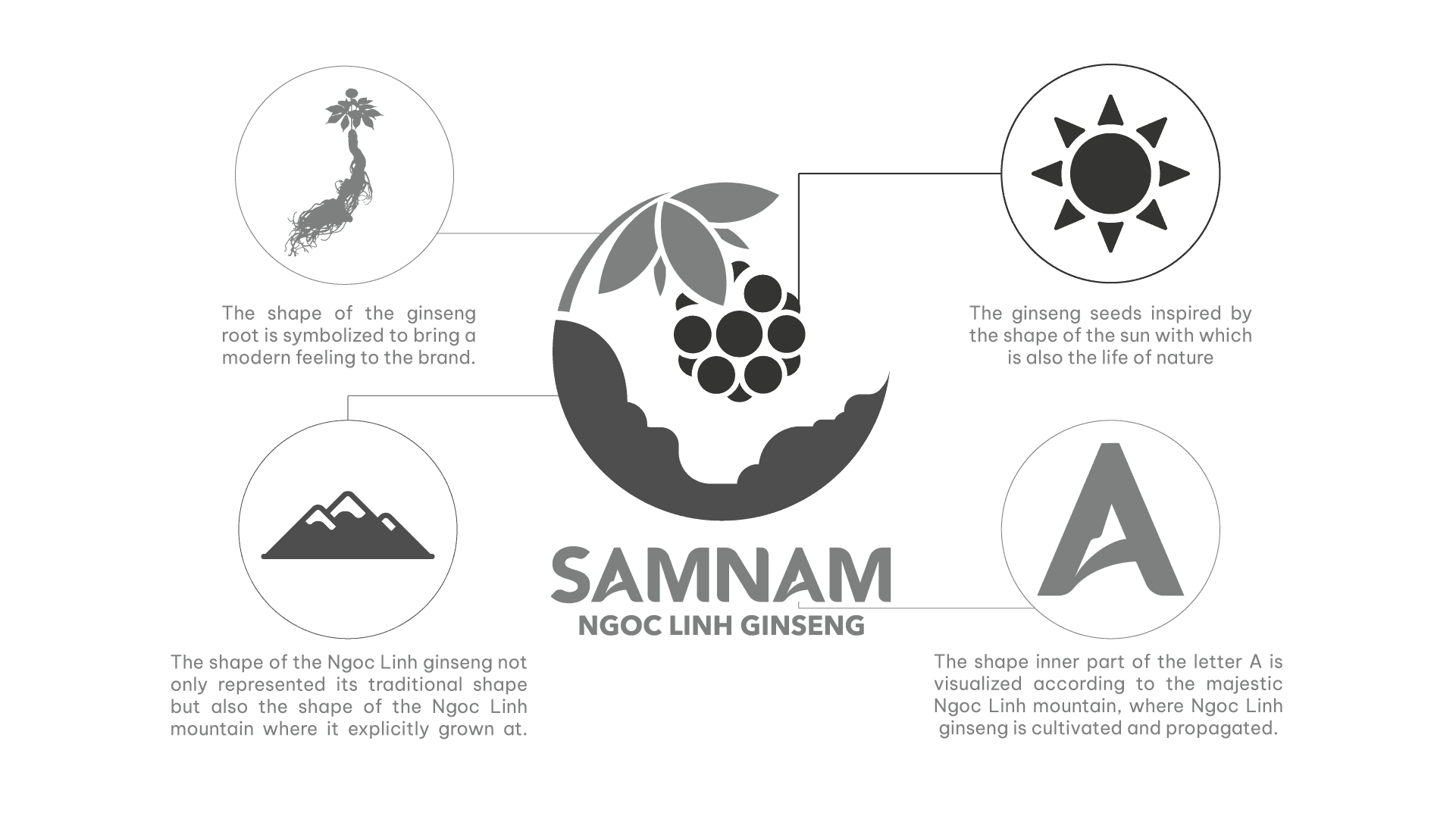
The shape of the whole ginseng tree embracing ginseng seeds shows the dedication in each product that the brand brings to consumers.
The round logo shape creates a sense of harmony, eternity, unity and perfection.
Logo Construction
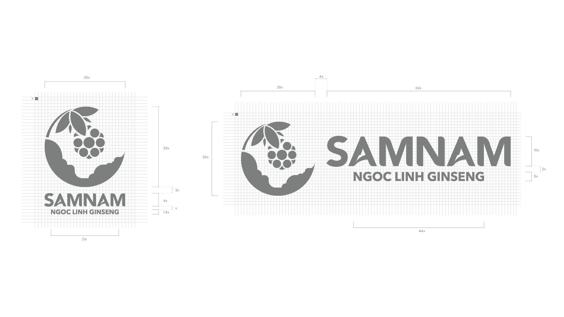
The guidelines for the distance and size of each element of the icon must be ensured to accurately, precisely, and consistently represent it. The spacing and proportions of the components have been established, and the proportions of the components in the icon must never change or move.
Logo Clear Space
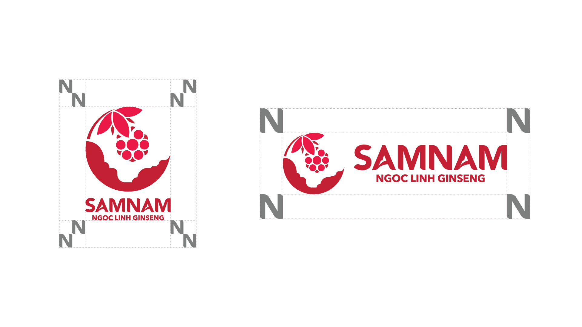
The safe zone is to ensure clarity, maintain visibility and recognition for the logo. The unit of measure is calculated based on the N letter in “SAMNAM”, which is considered the standard.
Logo Colour
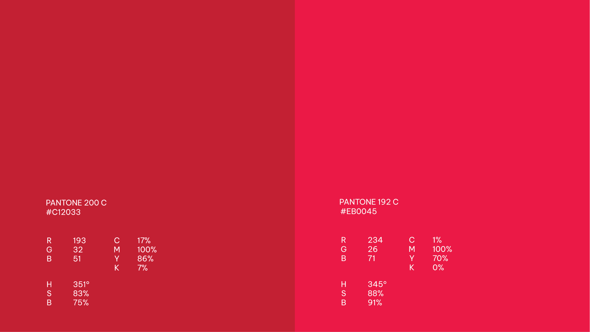
Primary colour palette is made up base on Ngoc Linh ginseng seeds color. In Asian culture, red is also a color that carries positive energy, all things related to red mean an increase in capacity and strength.
Logo Primary Colour
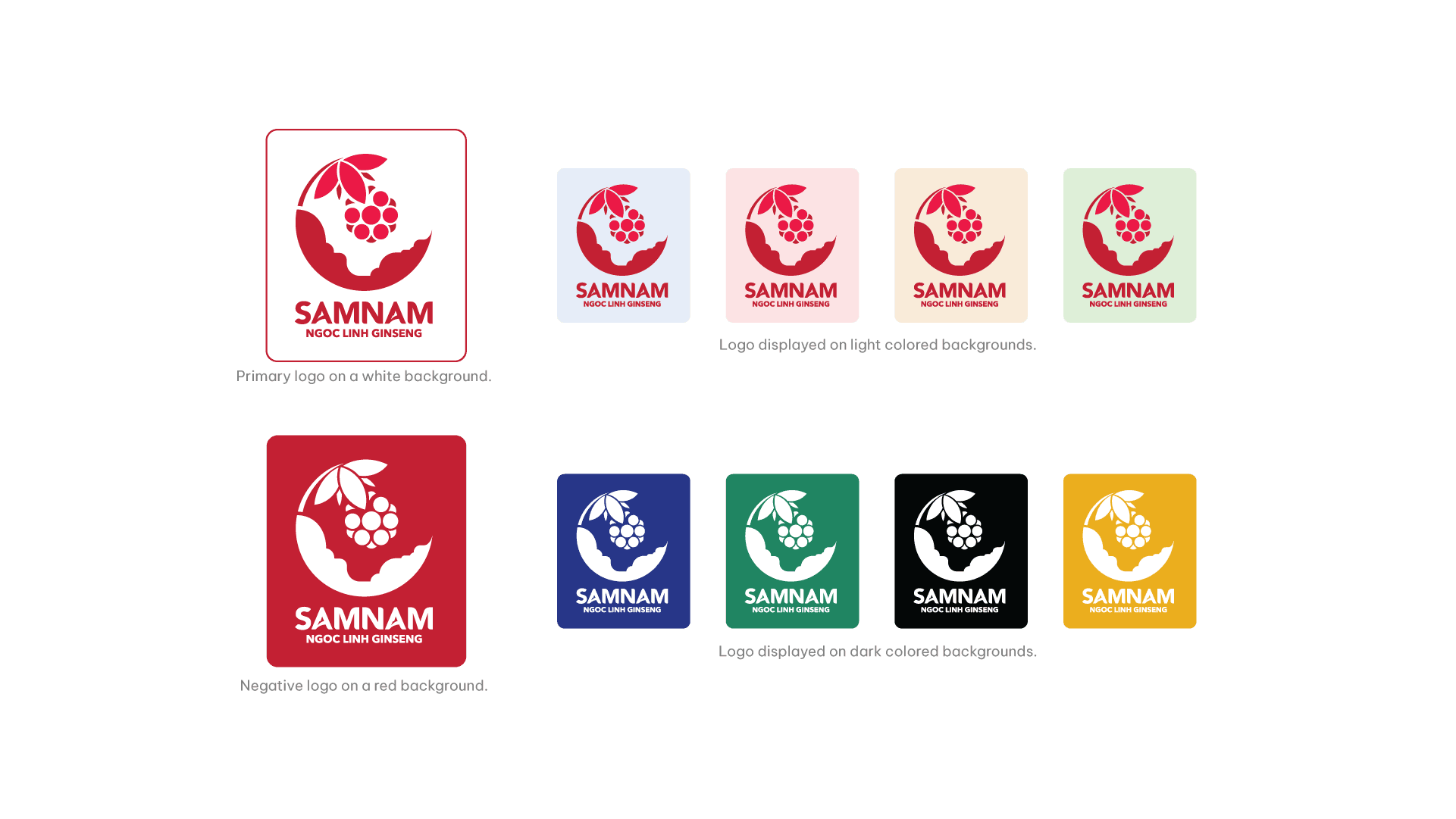
In cases where there are limitations in printing, communication, or materials that prevent the logo from being presented on a white background, please refer to the examples above. The purpose of these examples is to ensure an appropriate level of contrast between the logo and the background, so that the SAMNAM logo stands out and is easily recognizable.
Note: The primary logo is always recommended for use in most cases.
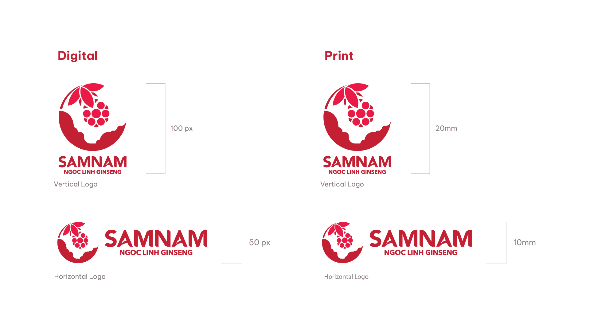
Logo Size
Whether using the logo’s positive version or its reversal, follow the instruction below:
Digital: The vertical logo cannot appear under a height of 100 px. The horizontal logo cannot appear under a height of 50 px.
Print: The vertical logo cannot appear under a height of 20 mm. The horizontal logo cannot appear under a height of 10 mm.
Incorrect Logo Usage
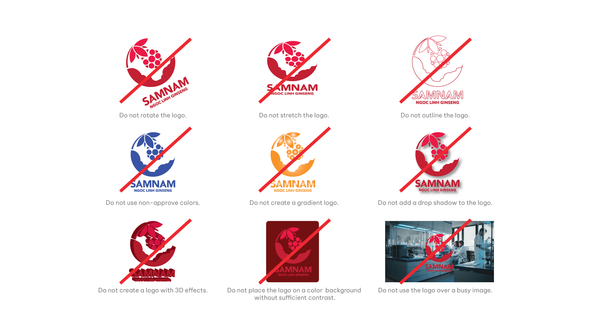
The following examples demonstrate incorrect ways to use the logo.
Logo Construction
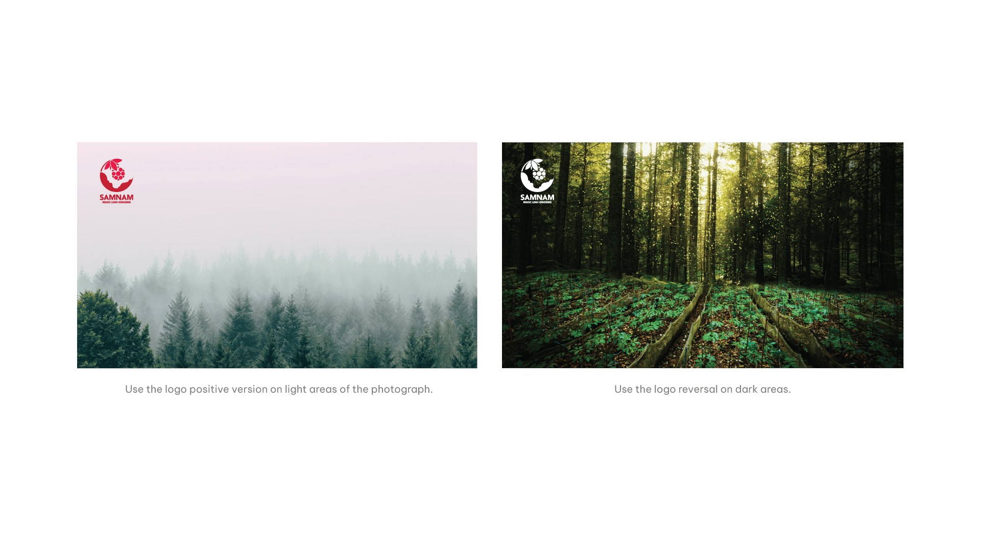
When the logo is placed on a photographic image, the image behind the logo must be light enough to provide contrast for the positive/full color logo or dark enough to provide contrast for the reversed logo. The logo should be placed on a clear area on the photo, without any detail that might compete with the logo. Use the logo positive version on light areas of the photograph. Use the logo reversal on dark areas.
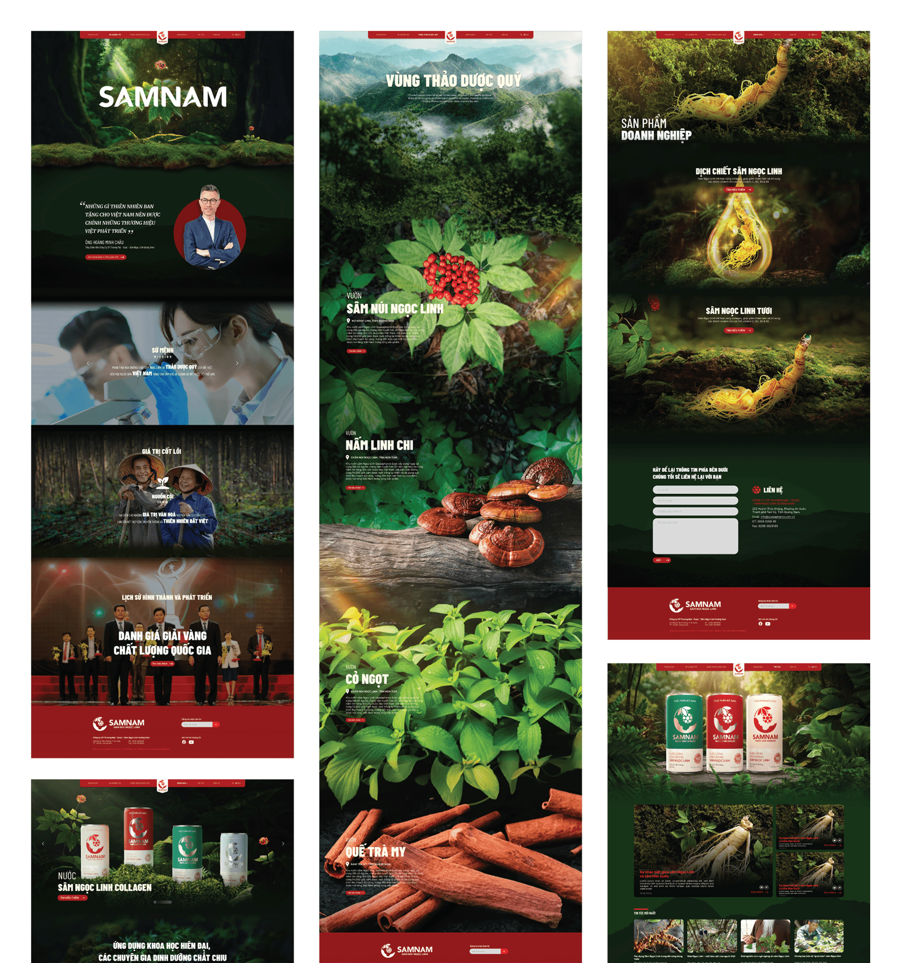
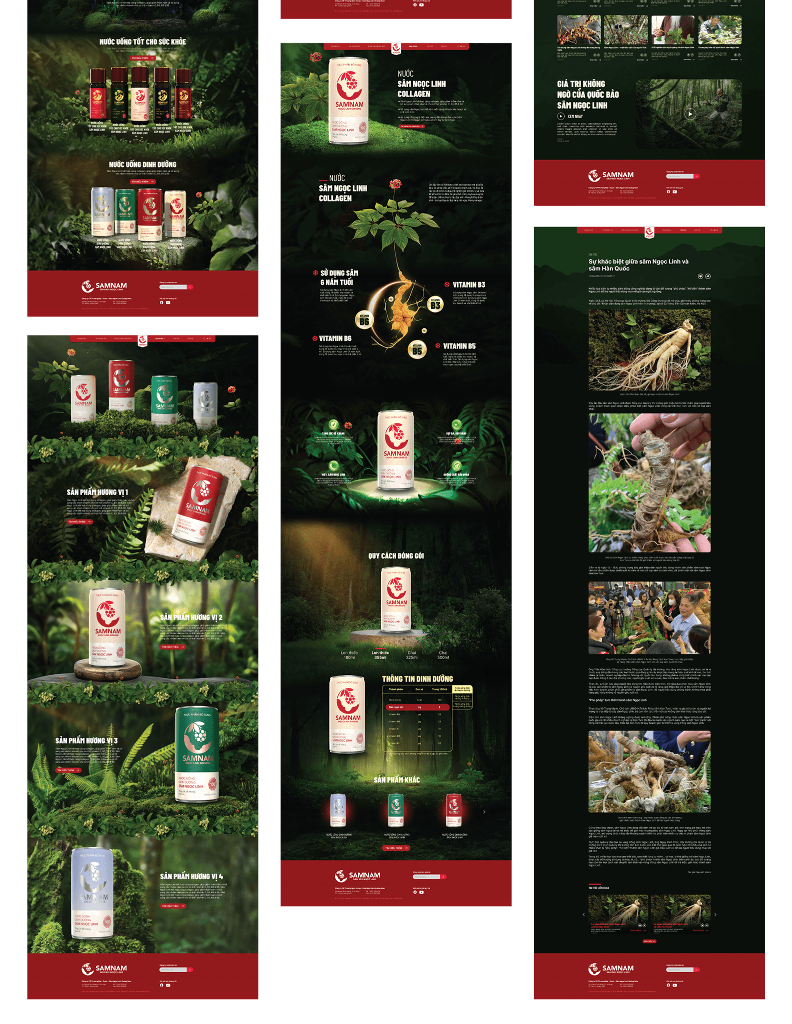
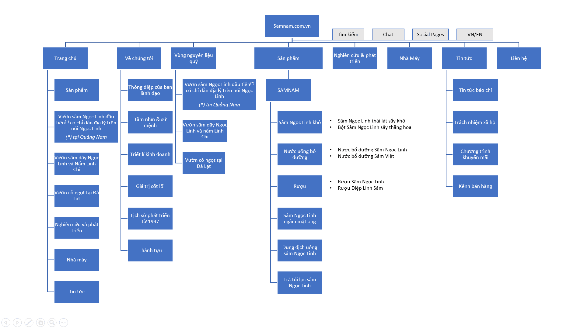
Website Structure
Website Design
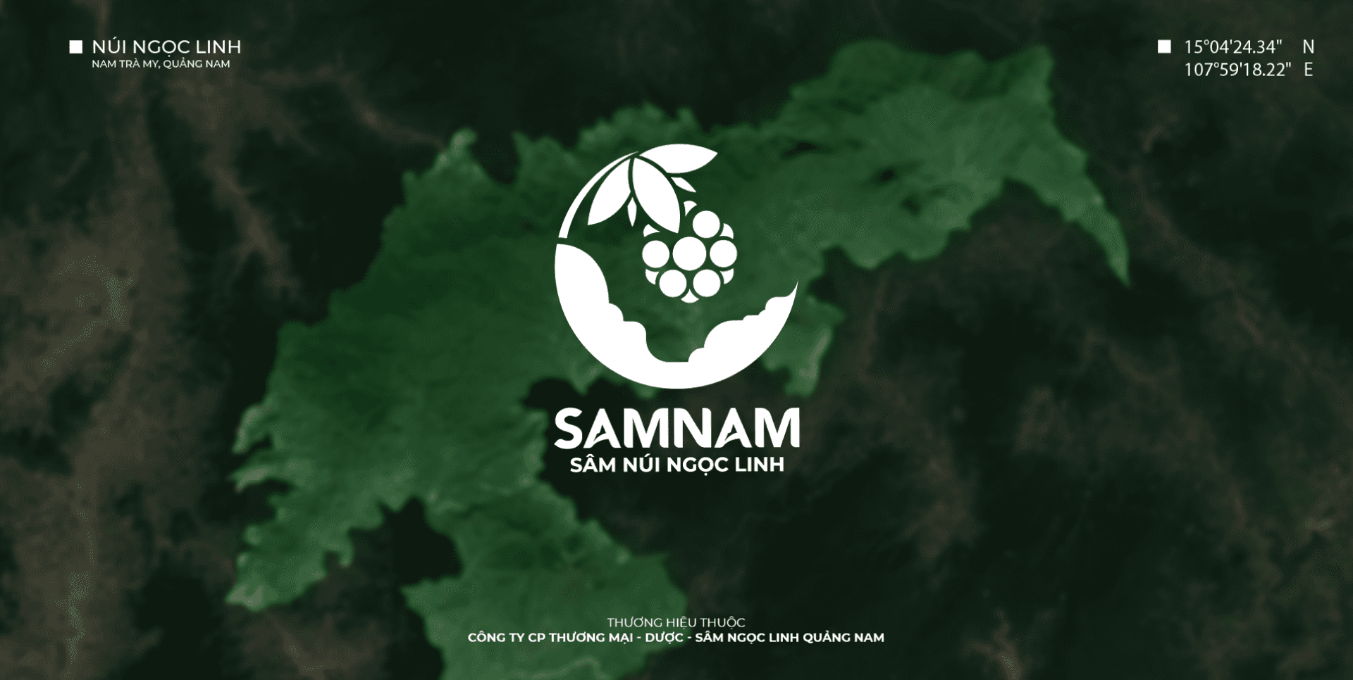
Loading page with Quang Nam map - Ngoc Linh mountain
Homepage demo with animation trigger when user scroll